A helpful home energy guardian

Haylo
Your power in your hands
Haylo empowers every home with the technology and tools needed to take control of home energy. Striking the right balance between sophisticated and accessible was the core design challenge.
Halo-inspired forms make up the visual language and capture the 'guardian' idea. The identity is designed to frame the brand’s helpful and empowering side.
DESIGNED AT ONWARDS (THIS BRAND NEVER LAUNCHED)
Branding
Motion design
Logo design
Digital design
With a strong name like ‘Haylo’ that has lots of visual connotations, the options were almost endless. The logo had to feel effortless and sleek in order to capture the essence of Haylo’s product.
The big idea was hidden in plain sight - adjusting the counter (inner circle) of the ‘O’ to mimic the shapes and forms of a halo. The angular shape alludes to a brand that is always in motion, thinking, decision-making.
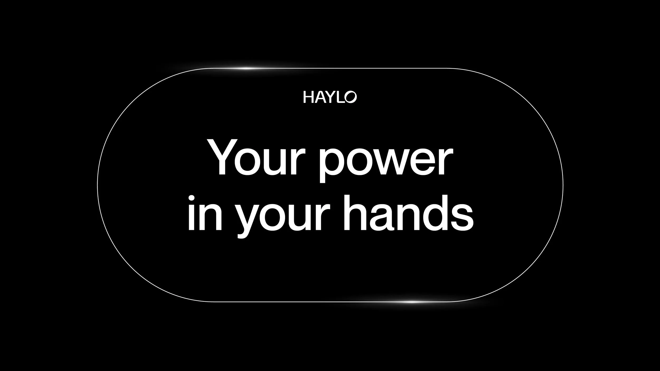
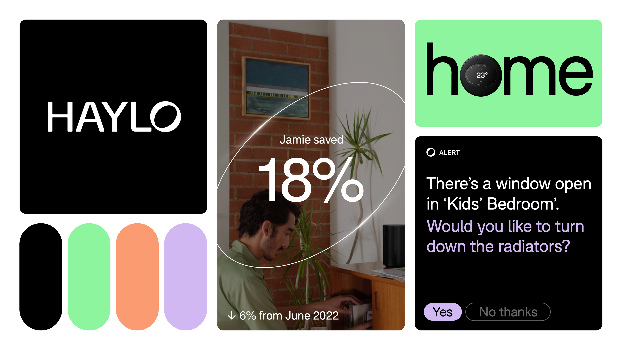
The shape of the logo inspired a wider set of circular shapes to frame brand messaging, capturing the technical side of Haylo. It was also really important to demonstrate the power behind Haylo’s products, so I introduced a glowing detail that illuminates and brings energy to system.


This product sadly never launched on the market. The brand identity however found a new home in Haylo Ventures - accelerating deep tech commercialisation.
CREDITS
Creative Director: Joe Ryrie (Onwards)
Designers: Mike Harrison (freelancer), Joe Smith (Onwards) & Dom Edwards (me)