Embracing the legacy of a “no-thrills” retailer

Mountain Warehouse
Proudly Practical
If I were to rebrand Mountain Warehouse, it would look a little something like this. Why? Because I wanted to show what a brand could become if it owned what made them different.
This fictional visual and verbal identity embraces who Mountain Warehouse really are, a proudly practical outdoor clothing retailer. By giving them a unique voice, they can inspire audiences both old and new in a rapidly growing market.
SELF-INITIATED PROJECT
Strategy
Branding
Art direction
OOH


By introducing a more technical edge to the logotype and a robust lockup by mirroring the ‘M’ to make a ‘W’, the design reflects Mountain Warehouse’s legacy of making high quality and innovative garments. People trust Mountain Warehouse for exactly this reason, so they should be proud of the products they produce.

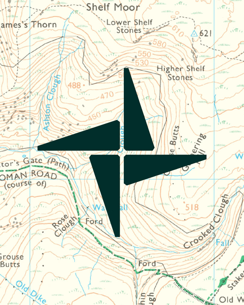
There’s a lot to like about the existing Mountain Warehouse symbol, and acts as a core identifier for the brand - so it’s here to stay. I created a new ‘north star’ born from the shapes within the ‘M’ and ‘W’, creating a greater sense of harmony between the two brand components.

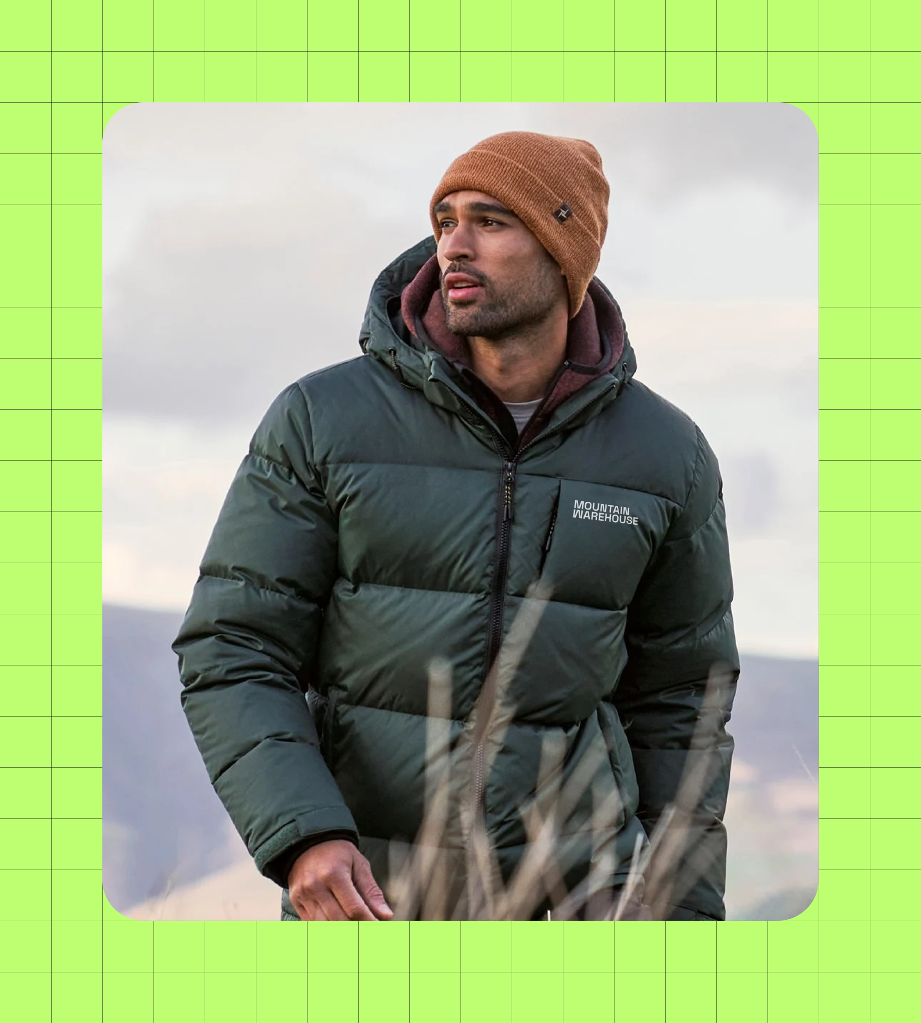
Mountain Warehouse stores across the UK are painted dark green and people recognise it. For that reason, the core green remains very close to the original. The new zingy green and purple however bring fresh energy to the brand. Finally, the off-white colour, inspired by OS maps, gives a light contrast to the the new darker green.


The tone of voice demonstrates just how well Mountain Warehouse know their audience, which in turn creates a greater sense of trust and connection with consumers. By leaning in to this fun and not too serious language, the brand suddenly has a personality people can align with and find humour in.
When it comes to imagery, much like the the underlying focus that features throughout the new brand, it’s about being proud of the products - putting them front and centre, big and bold.


The copywriting and tone of voice is intended to bring a warm and friendly humour that aligns with the overall approachability of the brand. It speaks to older audiences like parents and grandparents, as well as younger people falling in love with the great outdoors. In the right moments, adopting a ‘dad joke’ mentality also works.


The purpose of this project is to show how leaning into what makes a brand truly unique can ignite an entirely new meaning.
Hopefully this also demonstrates how a brand can still be practical, while having character and a modern design approach.
To reiterate, this brand concept is fictional and all imagery has been adapted based on products that belong to Mountain Warehouse. If you’re from Mountain Warehouse reading this, please don’t sue me 😉
CREDITS
Design, strategy & direction: Dom Edwards (me)
Photography: All product and lifestyle shots belong to Mountain Warehouse