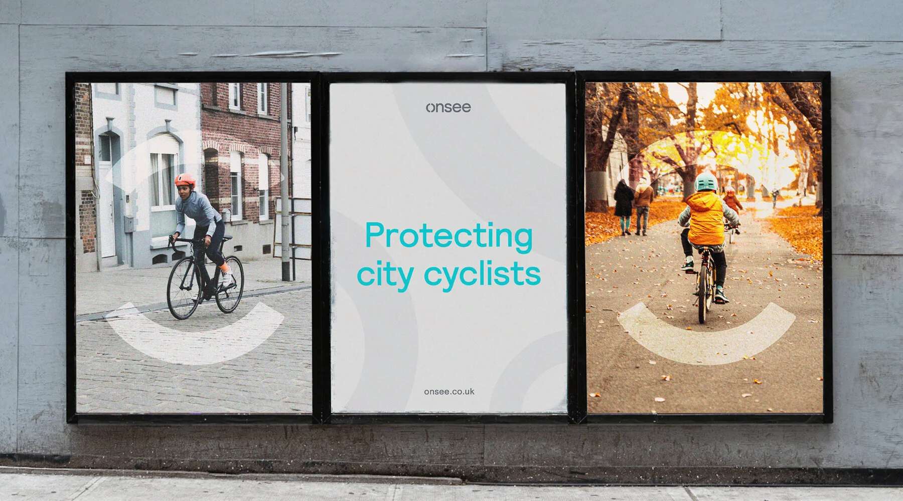
Humanising and protecting city cyclists

Onsee
Lighting up the cycling industry
Onsee needed a voice and visual language that would convey their brand to a diverse audience. This ranged from governing bodies like TfL to amateur city cyclists.
A confident and flexible brand that captures the notions of safety and protection, whilst reflecting their tech background and ambition to humanise cycling.
SERVICES
Naming
Strategy
Branding
Digital design
The first challenge with the client was coming up with a new name. Onsee (formerly known as Pelation) faced problems when prospects associated their product with existing consumer brand, Peloton.
The brand’s flagship product, a bike light and dashcam, has a unique eye-shaped design. This influenced my idea for the new name, which is a combination of being ‘all-seeing’ and how Onsee as a brand protects their cyclists and is always switched on, looking out for you.
Pelation’s previous logo didn’t reflect the simplicity and elegance of their product design. After various iterations, the final design focused on the importance of symbolising safety and protection.
I developed the Onsee ‘O’ logomark into a visual system that adapts from simple usages like map markers to an omnipresent symbol of protection and safety.


The ‘O’ symbol from the Onsee logotype and mark has been simplified and used to work across a set of icons that are used widely across the brand from interfaces to informative social media content.
This creates a coherent and identifiable visual language as users can spot the logo within smaller aspects of the brand.
